MedicalGuardian©
(2025)
Repositioning personal safety as a longevity co-pilot
MetaLab

Overview
Aging well isn’t just about staying safe. It’s about staying yourself.
Personal emergency response has long been sold through fear: the fall, the call, the worst case. Medical Guardian wanted to stand for something bigger. With MetaLab, we repositioned the brand around longevity instead of limitation, built a new foundation of purpose, personality and voice, and designed the identity to carry it, from a new mark and palette to typography, imagery, illustration and layout.
Studio
MetaLab
Services
Brand Strategy
Visual Identity
Verbal Identity
Web Design
Illustration
Collaborators
Haley Bridges
Idoia Gkikas
Brian Perez
Shabnam Gideon
Natalie Kent
Aimee David
Justin Sims
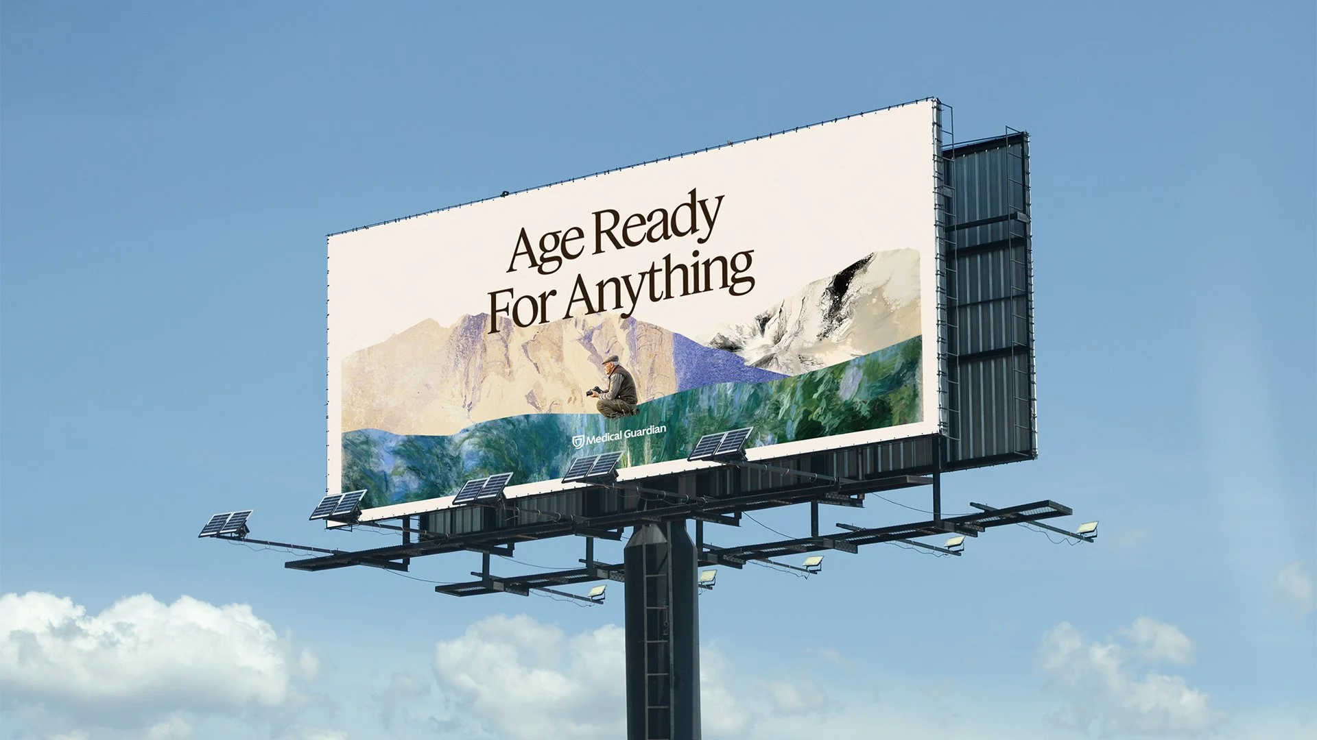
The Brand Concept
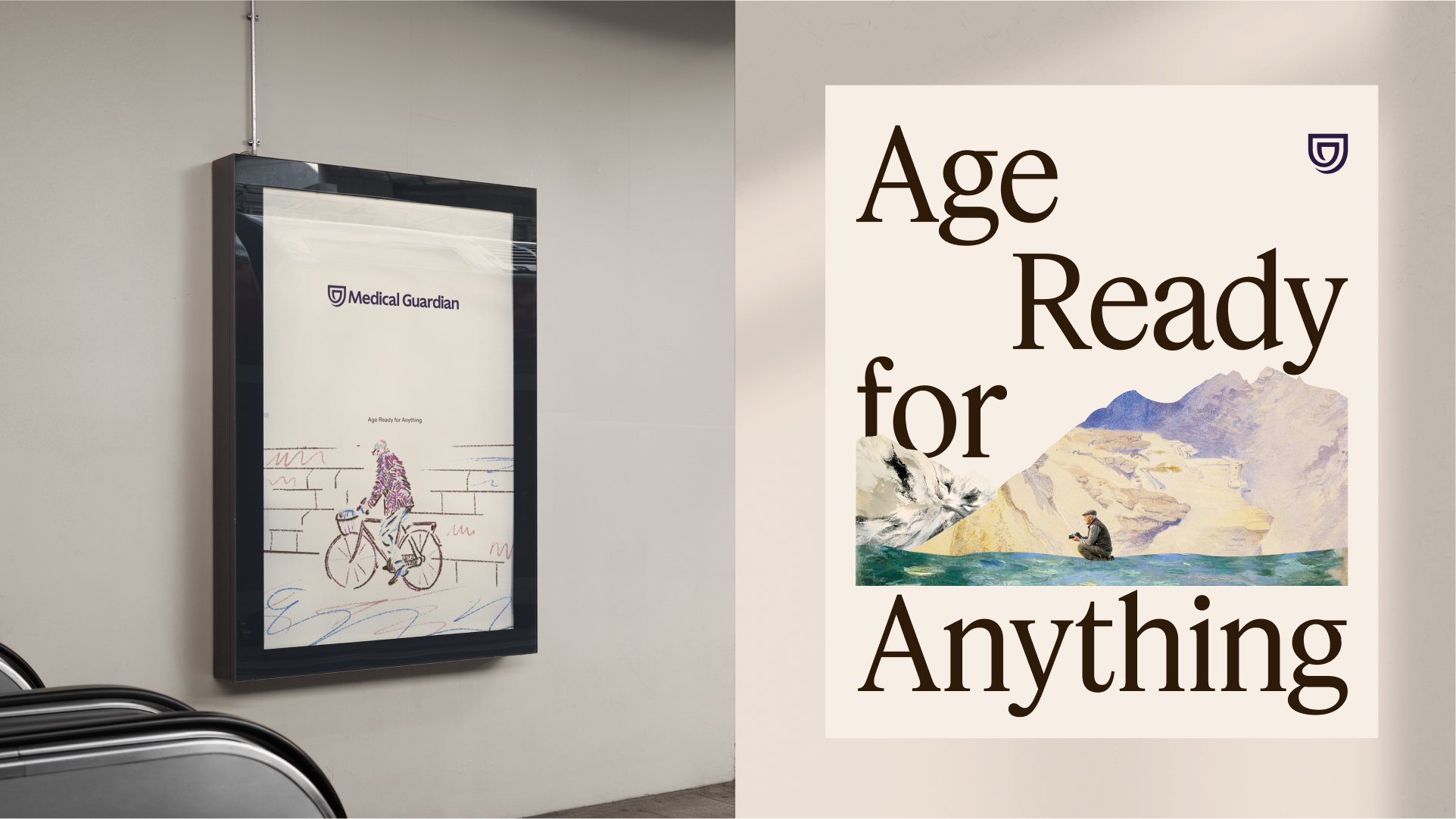
The platform, Age Ready for Anything, flips the category. Where others see aging as retreat, Medical Guardian sees an adventure, and positions itself as a longevity co-pilot: steady support that knows when to step in and when to cheer from the sidelines.
The identity grows from a concept we called The Art of Care, which treats a life as an ongoing masterwork shaped by eras, movements and reinvention. The symbol’s softened, overlapping lines suggest a hand in motion, a gesture that protects and lifts.


Golden
We named the feeling every touchpoint should leave behind: Golden.
It is a quiet confidence, the warmth of being supported without being smothered, and the sense that life is still yours to shape. Mapping the emotional shift from “before” to “after” gave the team a simple test for every headline, image and interaction.

Color & Type
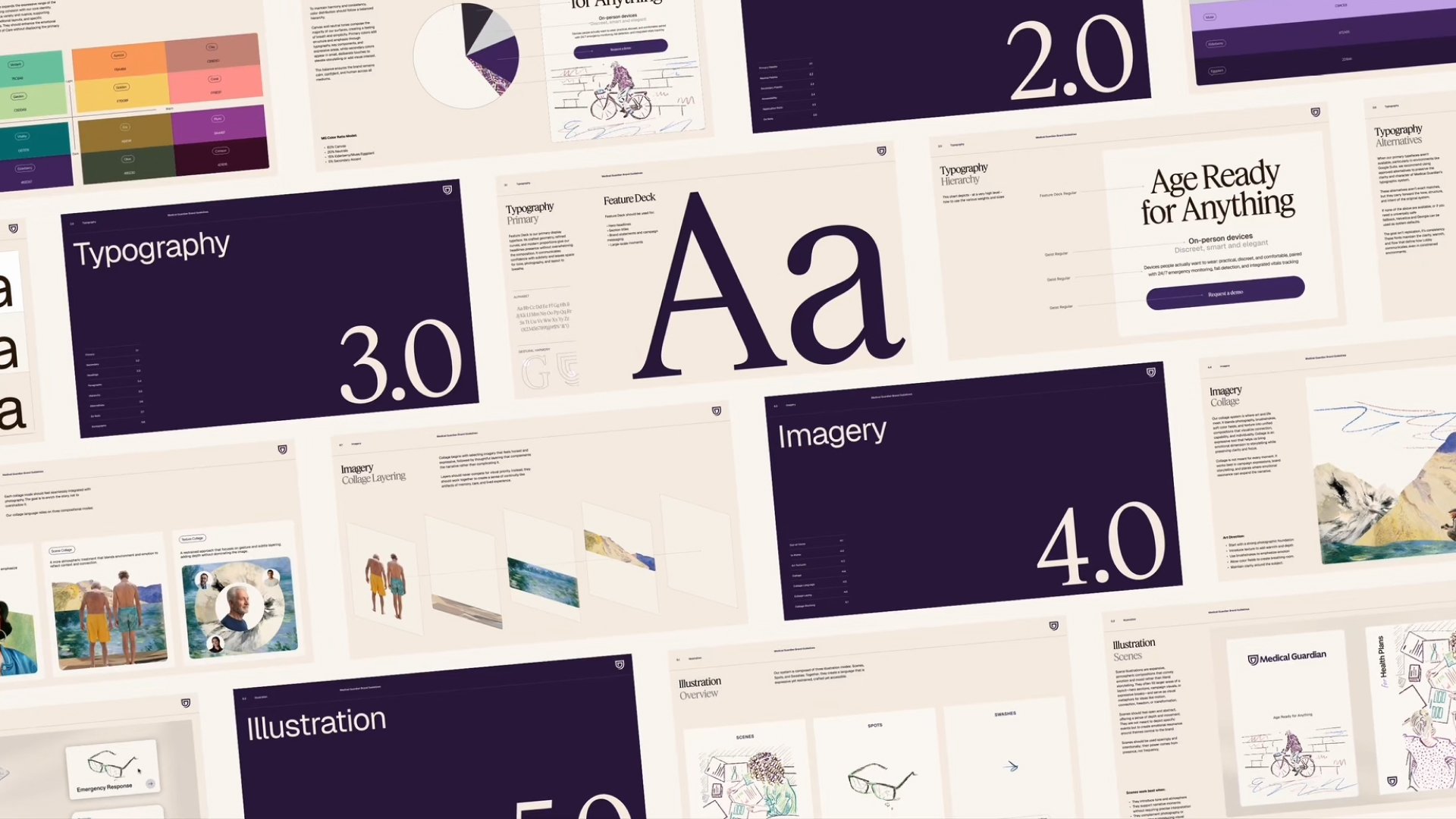
Eggplant and Elderberry anchor the brand with depth and warmth. Canvas gives every layout room to breathe, and Muse adds a touch of radiance.
A fifteen-color secondary palette extends into illustration and collage without crowding the core. Feature Deck sets crafted, confident headlines, and Geist keeps product and long-form copy clear. Every text pairing is built to meet WCAG AAA.
Visual Language
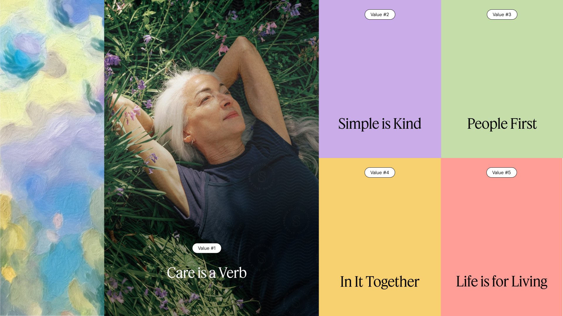
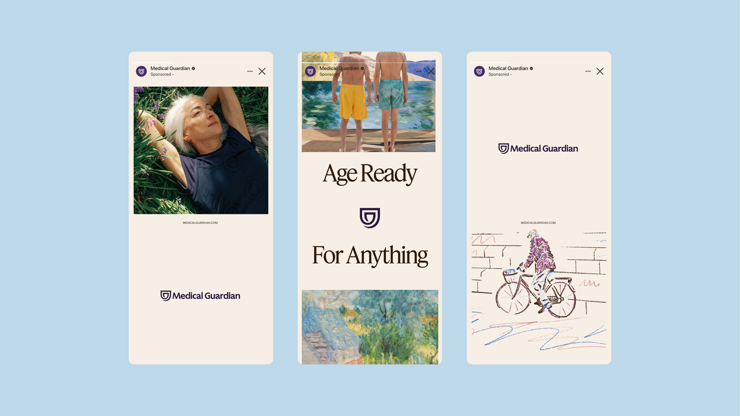
Photography shows people in motion, never fragile and never clinical.
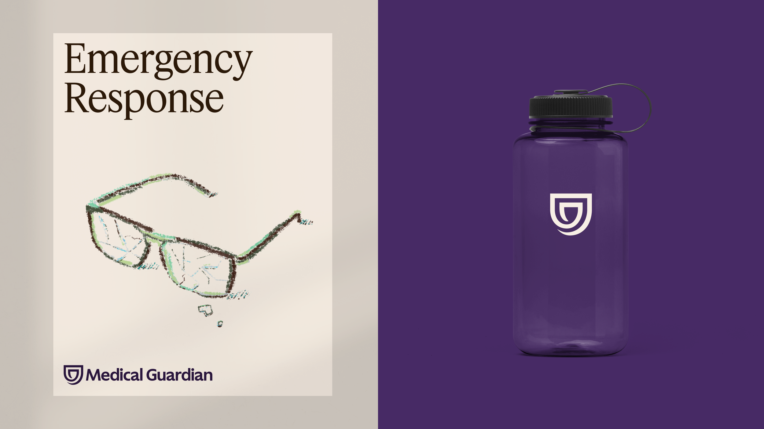
A collage system layers that photography with brushwork, texture and soft color fields to bring emotional depth to campaign moments. Illustration is built from a single confident line, drawn with a pastel-textured brush, that adds a human hand to product and feature storytelling.

Product & Web
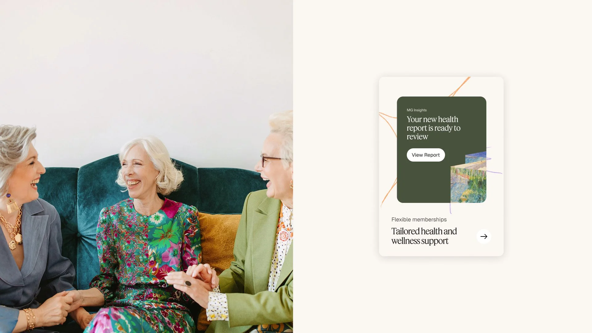
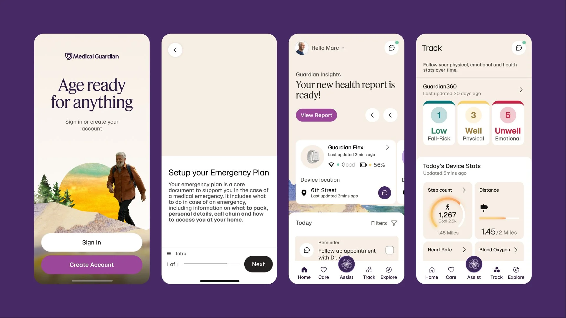
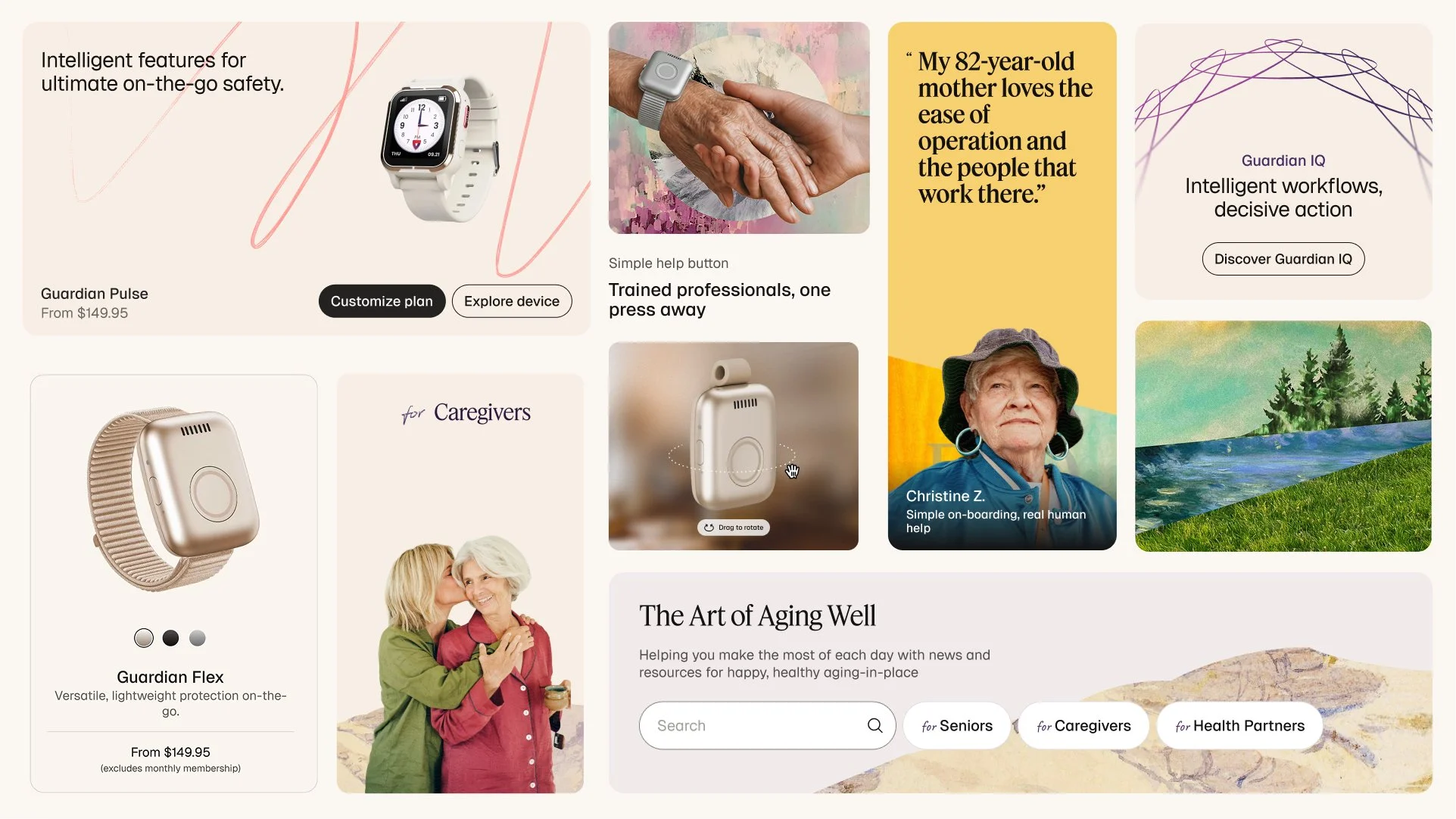
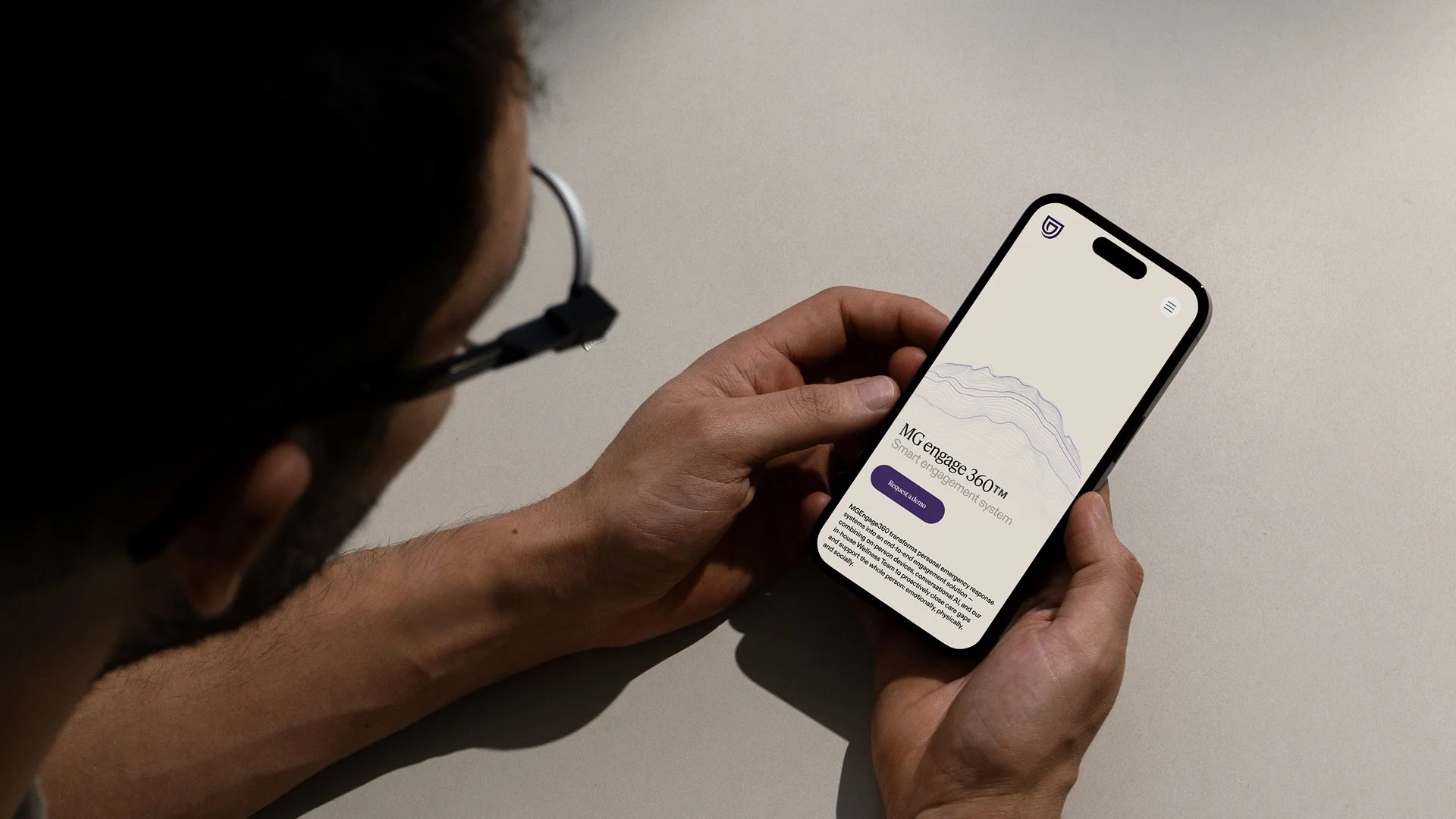
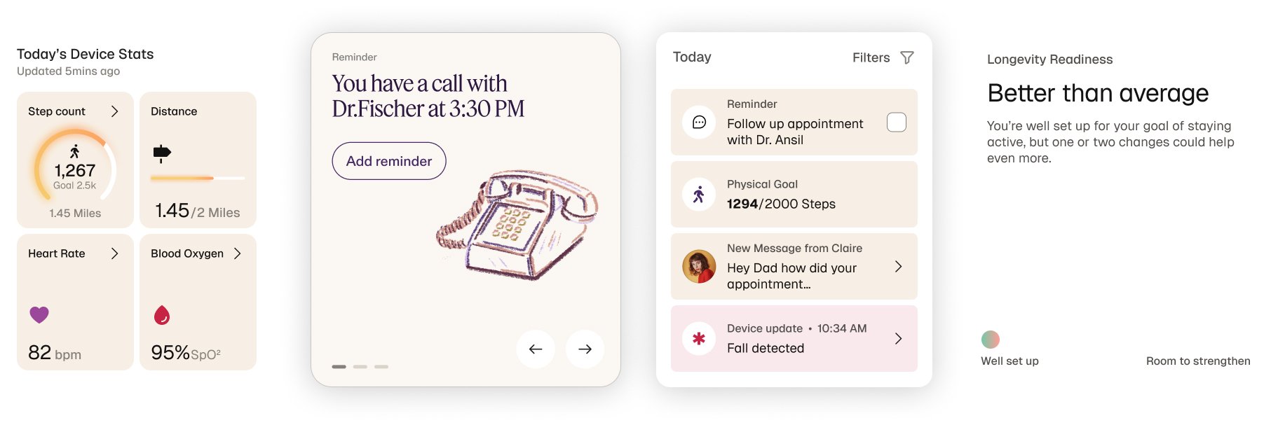
The system carries into the Guardian app, device pages and the new website.
Canvas surfaces, Feature Deck headlines and Elderberry accents bring the brand into setup flows, health reports and care-circle updates, so everyday product moments feel as calm and confident as the campaign.
Voice
The brand speaks as The Illuminator: a wise co-pilot, not an emergency button.
The voice is grounded, clear and vibrant, rooted in reality, warm in affect and encouraging without tipping into sugar. Messaging is mapped to four audience archetypes, from the Simplicity Seeker to the Confident Explorer, so every product story meets people where they are.

Status
Brand Book 1.0 was delivered in December 2025, and the rollout is still underway, so the full story will follow after launch.
Next project — Formance ↗
Next project — Formance ↗
InfoSenior brand designer working across brand identity, design systems and creative direction.
ContactAvailable for select projects.
Let’s work together.
Cleveland, OH
Eastern Time
Copyright © 2026 Jason Tiberio. All Rights Reserved.