Formance©
(2024)
Visual identity and web for an open-source payments platform
Odi Agency
Overview
Formance’s infrastructure solution tackles the challenges that payments engineers, heads of payments, and product managers often face.
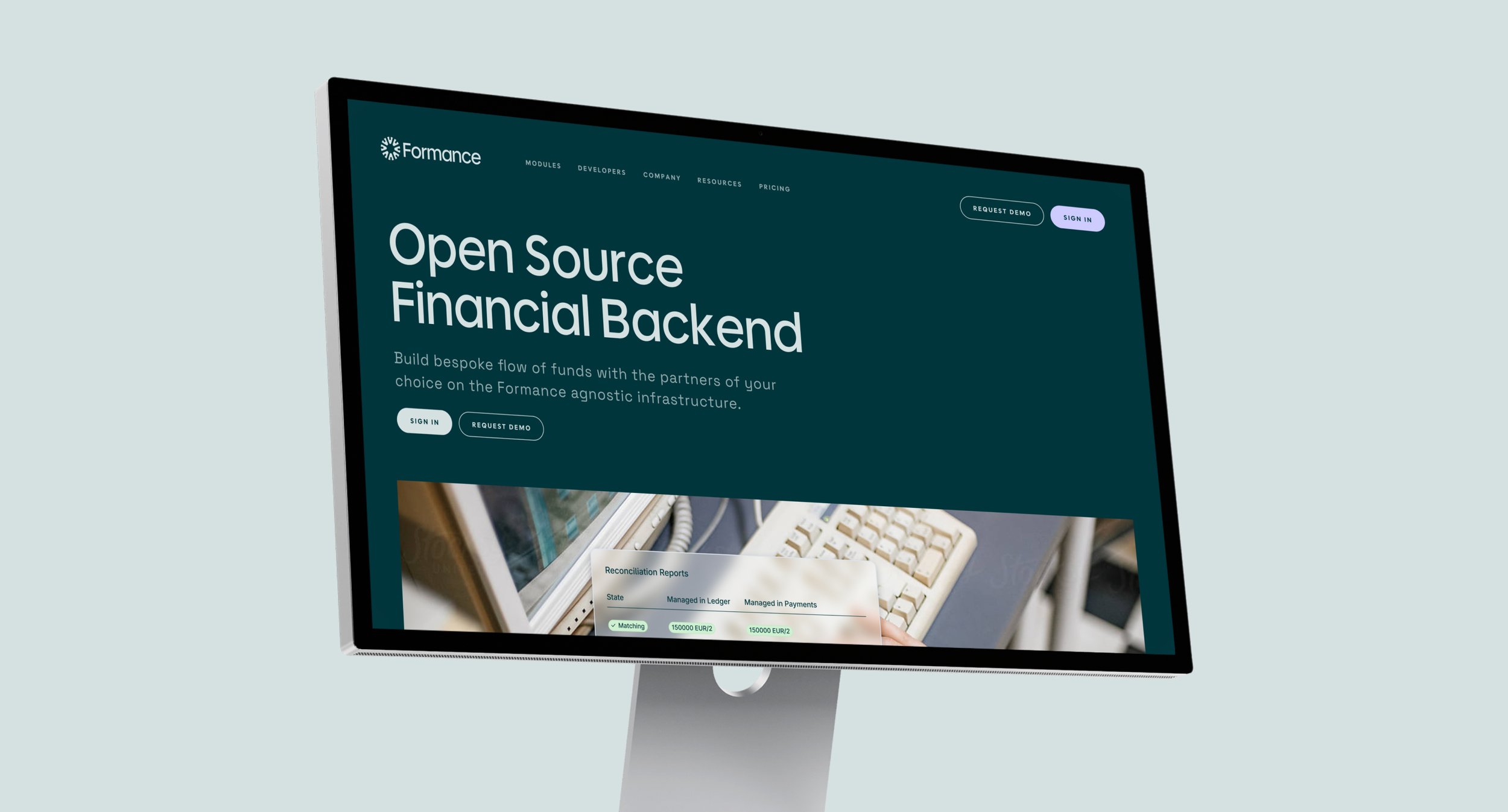
Formance needed a brand identity that captures the full range of its vision and client needs. With powerful tools for managing complex fund flows, it helps businesses stay ahead and keep innovating, and it needed a fresh identity that better communicates that impact.
Studio
Odi Agency
Services
Visual Identity
Web Design
Collaborators
Stetson Finch
Charisse Bennett
The Brand Concept
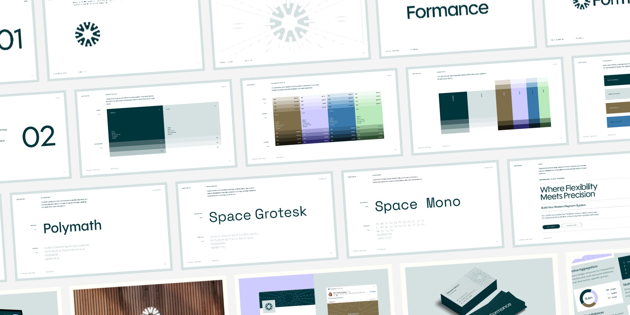
The identity centers on a logo called the Connector, symbolizing Formance’s role as a central hub for financial infrastructure.
Its circular, fluid design represents both approachability and technical empowerment, while the logotype in the Polymath typeface combines geometric precision and modern styling.


The mark’s radiating lines scale up into a full pattern
Visual Language
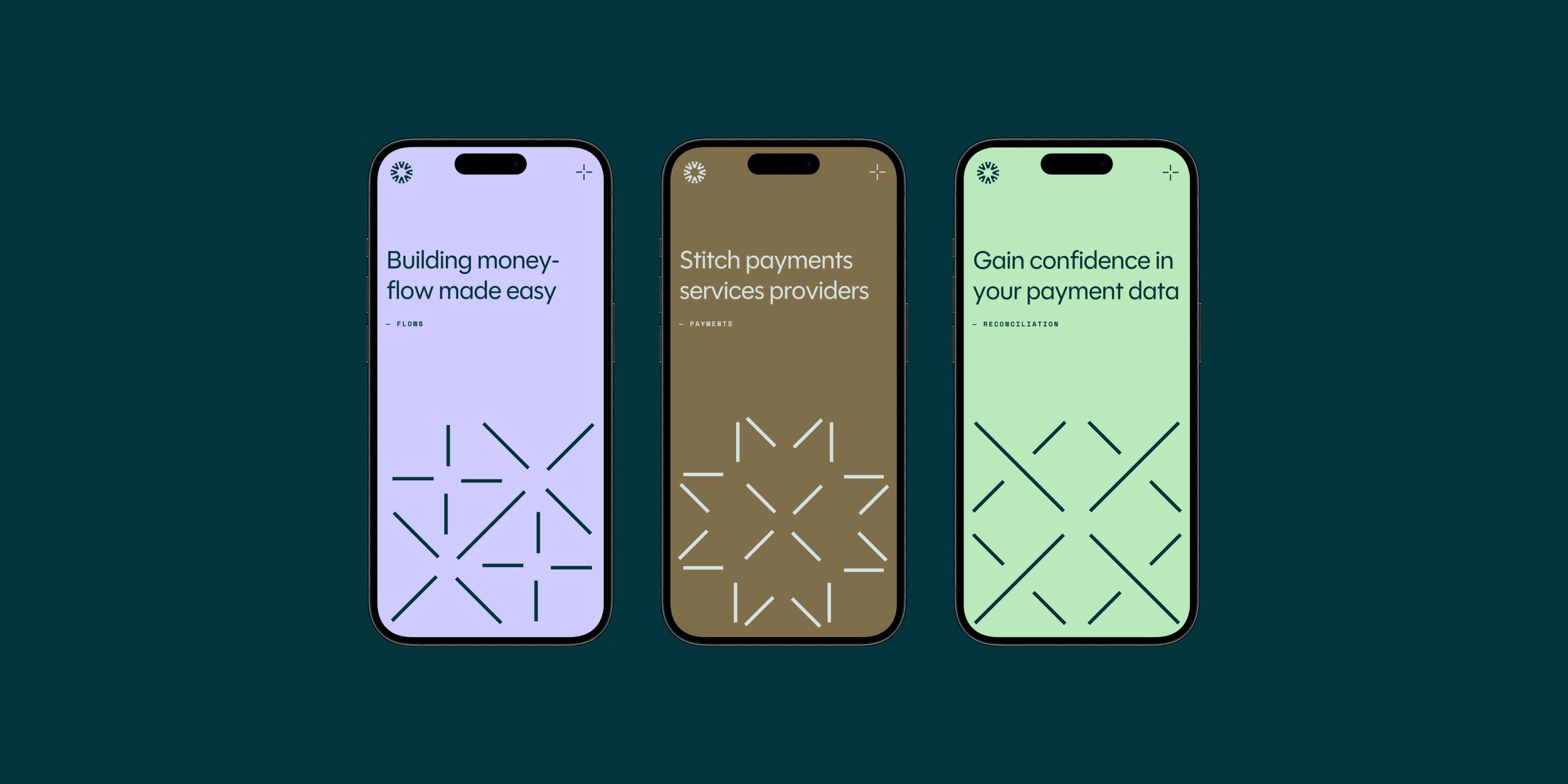
The visual language is grounded in the Connector concept, extending across every brand element.
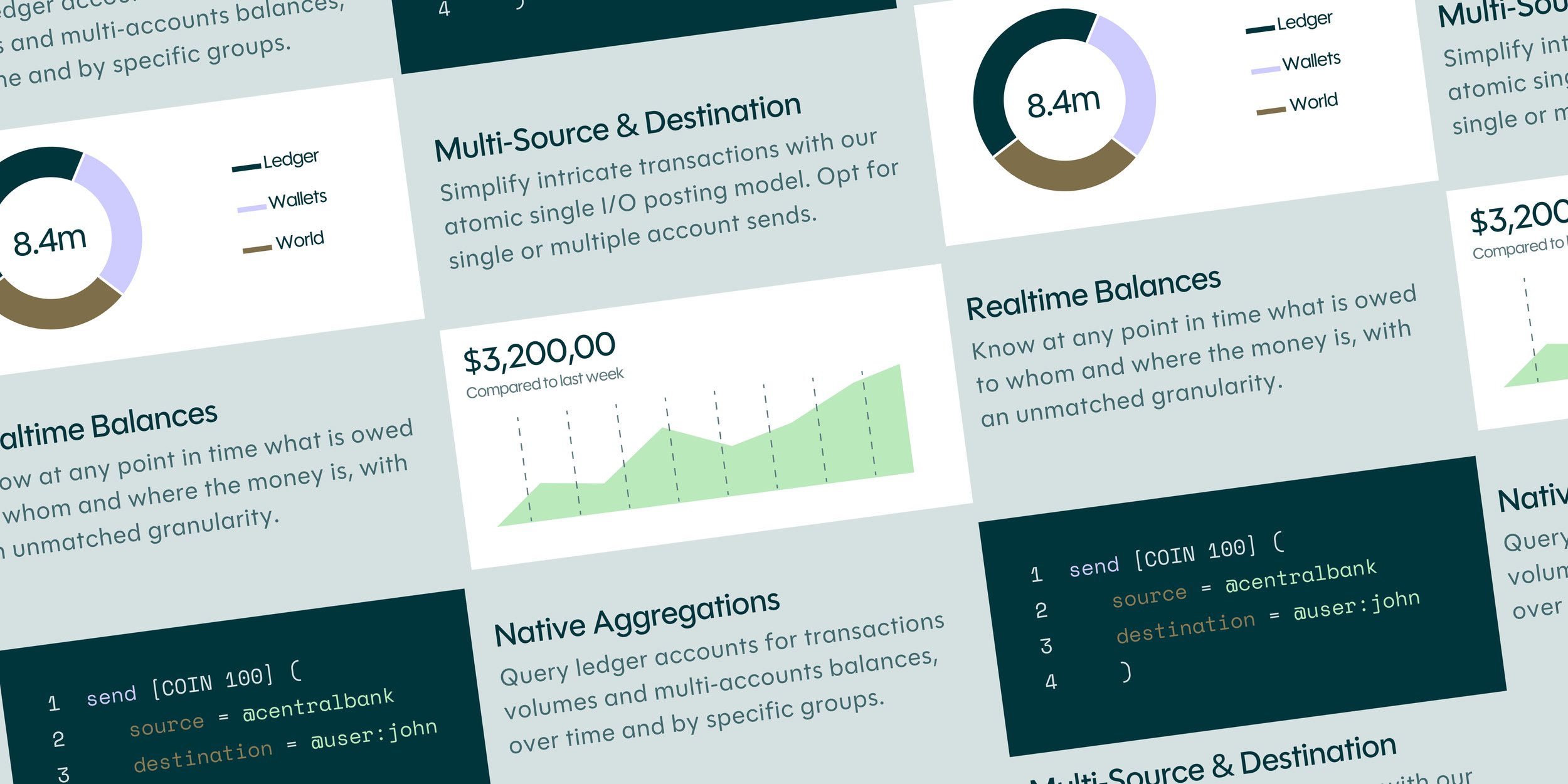
It reflects customization and interconnected payment solutions, with adaptable shapes and scalable graphics that reinforce infrastructure strength and platform modularity.



Next project — Perion ↗
Next project — Perion ↗
InfoSenior brand designer working across brand identity, design systems and creative direction.
ContactAvailable for select projects.
Let’s work together.
Cleveland, OH
Eastern Time
Copyright © 2026 Jason Tiberio. All Rights Reserved.