Perion©
(2023)
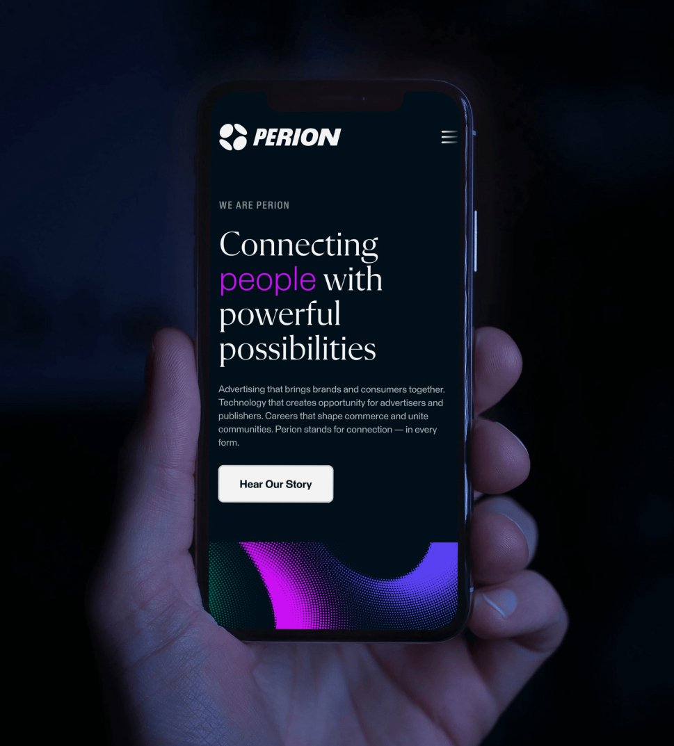
Visual identity and UI for an advertising technology company
Focus Lab

Overview
Perion offers cutting-edge technology solutions that connect advertisers and publishers with consumers globally.
They approach advertising with a blend of art and technology, driven by a passion for its economic impact. To showcase their unique perspective and build a cohesive brand identity, especially after a series of acquisitions, Perion partnered with Focus Lab.
We assessed Perion’s evolving structure and developed a branding strategy that aligned with their future business goals. They identified four core attributes—Brave, Confident, Dynamic, and Innovative—which shaped the brand’s positioning and new visual identity.
Studio
Focus Lab
Services
Brand Strategy
Visual Identity
Verbal Identity
Brand Architecture
Collaborators
Wade Livingston
Haley Bridges
Justin Sims
Brian Perez
Will Straughn

The Brand Concept
The brand concept, “Vantage,” highlights Perion’s pioneering technology and unique perspective.
The logo, “Apex,” with its four orb-like elements, symbolizes cohesion, dynamism, and the diverse expertise of Perion’s team. The logo's 3-D effect blends art and science, creating a compelling representation of Perion’s identity.

Apex: four orb-like forms that read as one
Visual Language
The orb-like elements in the logo extend into dynamic effects, driven by textures inspired by pop art, creating a portal effect.
Other features, such as orb-like photo cropping and compositions, further expand on the logo and unify the brand. The use of Flecha M, Perion’s primary font, blends artistic and structured elements, conveying a premium feel that achieves sophistication without rigidity.


Glow arcs come in three weights: heavy, medium and light


Next project — Nitrogen ↗
Next project — Nitrogen ↗
InfoSenior brand designer working across brand identity, design systems and creative direction.
ContactAvailable for select projects.
Let’s work together.
Cleveland, OH
Eastern Time
Copyright © 2026 Jason Tiberio. All Rights Reserved.